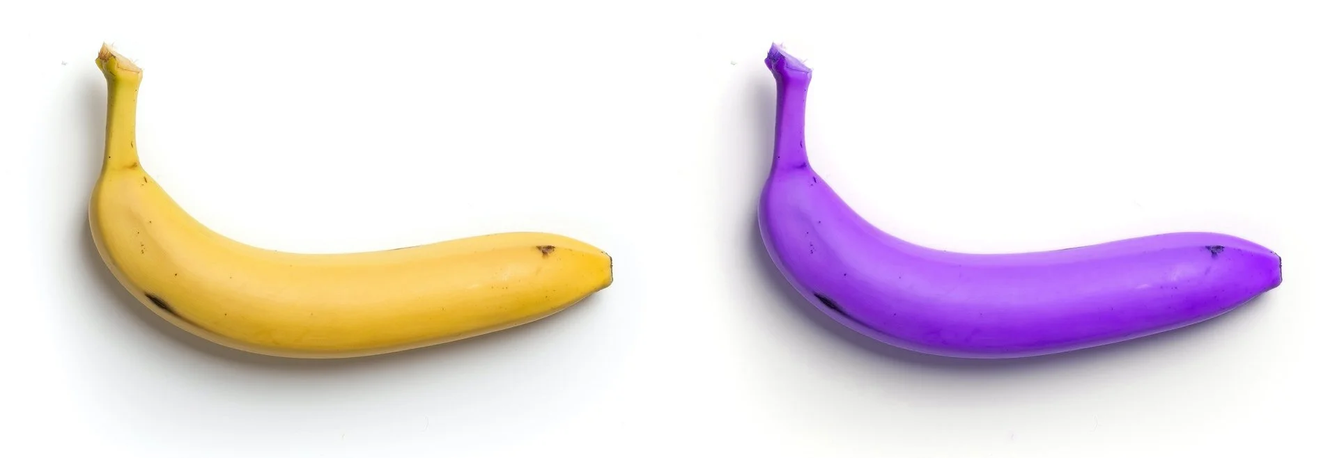
Memory colours and purple bananas
Memory colours are the colours we imagine things to be based on our personal experiences.
When asked most people will say that a banana is yellow, the sky is blue and the grass is green.
In most cases, memory colours will increase the validity of an image. We are hardwired to believe objects have an associated colour.
But what does this have to do with content creation?
The short answer is… everything.
If we understand how people react to colour, we can use it as a creative tool.
Imagine we want the banana to look ripe and fresh? Then it has to be the right shade of yellow and definitely not purple.
It’s a simple but fundamental concept for image making and something we should be using more.
Knowing how colour can change our perception is a powerful tool.
SOUL©Disney/Pixar 2020
Science Fiction and Fantasy does this brilliantly. Strange new worlds are created with a completely different colour palette to the one we know.
This is the inverse effect of memory colours in action. Here if we see something that resembles a purple banana, we don’t suddenly shout “that should be yellow” at the screen.
Our now purple banana looks just right because it’s from another dimension.
Colour plays a vital role in creating emotion and making your audience feel something extra.
Let your audience feel more of what you intended and start thinking about how to use colour grading in your productions.


